
ASO: how players find your game in the store
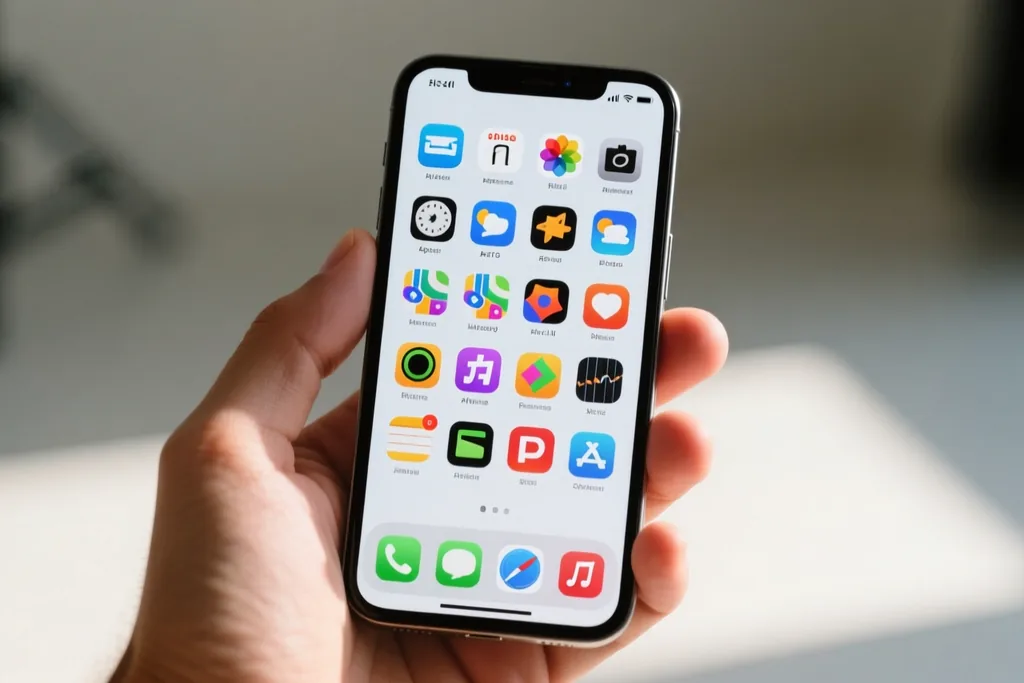
App Store Optimisation is the work of helping the right players discover a game on a store page and decide to try it. It is a craft of small, testable decisions rather than a single clever trick, and the parts a small studio controls are more numerous than most teams realise. This is how we approach the store listing before and after a launch.
The store page as a first impression
A store page is judged in seconds, in the same way a shop window is. The icon, the first screenshots and the title are doing most of the work, and a player who is unconvinced will not scroll far enough to read the features. Everything below the fold is for players who have already decided to consider the game.
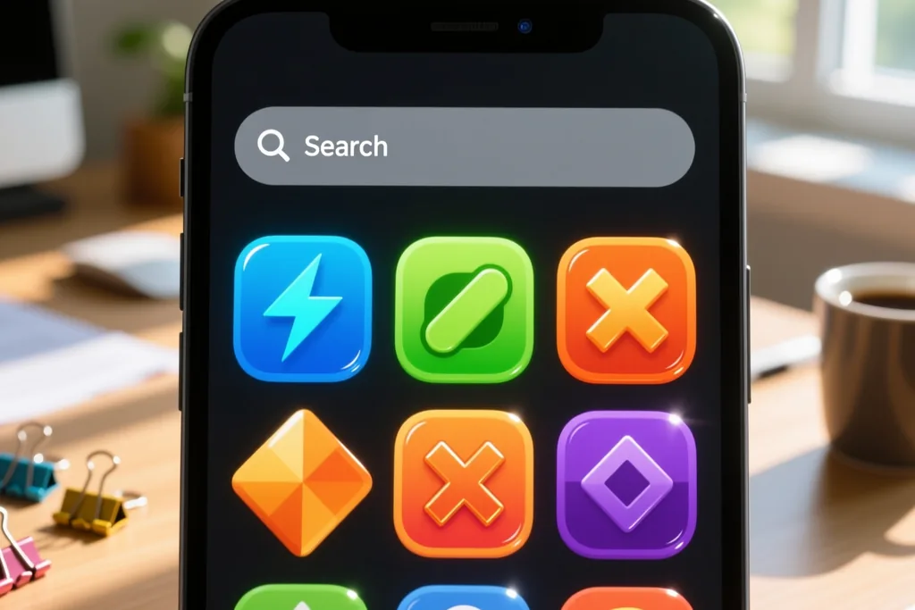
So we treat the top of the page as the whole job and iterate there first. The goal is not to describe the game completely but to give the right player enough reason to tap and find out, and to give the wrong player enough information to move on.
Icon, title and subtitle
The icon is the smallest and most important asset on the page. It has to be recognisable at thumbnail size, distinct from its neighbours, and honest about the game behind it. A clever icon that does not describe the game wins a tap and loses a player, which is worse than no tap at all.
The title and subtitle carry the promise. We aim for a name the player will remember plus a short line that says what the game is, using words the audience actually searches for rather than words we find elegant. Plain description beats clever wording every time.
Screenshots that show the loop
Screenshots are where most listings leak players. A row of menus and settings tells a new visitor nothing, while a short sequence that shows the actual play tells them almost everything. The first shot should show the core loop in action, and the ones after it should show something the player will want to reach.
- The first screenshot shows the game being played, not a menu.
- Each later shot adds one new reason to try it.
- Any caption is short enough to read at thumbnail size.
- Nothing important is hidden behind a tap or an arrow.
We test screenshots by shrinking them and asking someone to explain the game back to us. If they cannot, the pictures are not doing their job yet.
Keywords and honest discovery
Keywords matter, but they work within the limits of the store and they cannot rescue a page whose pictures and promise are weak. The table below is how we think about the balance between the parts a studio controls and what they can realistically influence.
| Part of the page | What it does | How much we control it |
|---|---|---|
| Icon | Wins or loses the tap | Fully |
| Title and subtitle | States the promise | Fully |
| Screenshots | Shows what play is like | Fully |
| Keywords | Helps search reach us | Partly |
| Reviews | Settles a hesitant visitor | Only through the game |
Testing the page, not guessing
Store pages can be changed, and that makes them testable, which is easy to forget. Small variations in an icon or a first screenshot can be compared over time, and the results are usually more useful than anyone's opinion about which version looks nicer. We change one thing at a time and give each change long enough to be read.
The most common mistake is testing too many things at once and learning nothing. A disciplined studio changes one asset, waits for honest data, and keeps or reverts that asset before touching the next. It is slow and it compounds.
The description and the short read
Most visitors will not read a long description, so it has to reward the second or two it gets. The first line should say what the game is and who it is for, in plain words, and the rest can carry detail for the small number of people who look for it. A description that starts with lore rather than clarity loses the reader before the lore can matter.
We write the store text last, after the game and the screenshots are settled, because a page written early usually promises something the pictures cannot support. When the words, the images and the game all agree, the page reads as trustworthy even to a visitor seeing it for the first time.
The page after launch
ASO does not end at release. A live game keeps generating reviews, and the rating and the words in those reviews become part of the page whether the studio likes it or not. Reading them honestly and acting on the recurring complaints is one of the most effective forms of optimisation there is, because it improves both the game and the page at once.
We treat the store page as a living thing rather than a launch task. It changes as the game changes, and every change is a chance to give the right player a clearer reason to tap. That habit, done patiently over a game's life, does more for discovery than any single clever idea.
Read next
Mobile game trends worth watching
The shifts in mobile play we follow, and how a small studio reads them without chasing noise.
Playtesting: how to run sessions that change your game
Recruiting the right players, asking the right questions and turning notes into fixes.
Player retention: why players leave and how to win them back
The early signals of churn and the loop changes that give players a reason to return.